BoosterHub Logo
BoosterHub needed a brand identity that felt native to gaming culture while still being clear, memorable, and usable across product surfaces and social channels.
Branding is not usually my main focus, but in this case it made sense to shape both the product direction and the identity together. The goal was to create a mark that felt logical, flexible, and strong enough to live across digital touchpoints from the start.
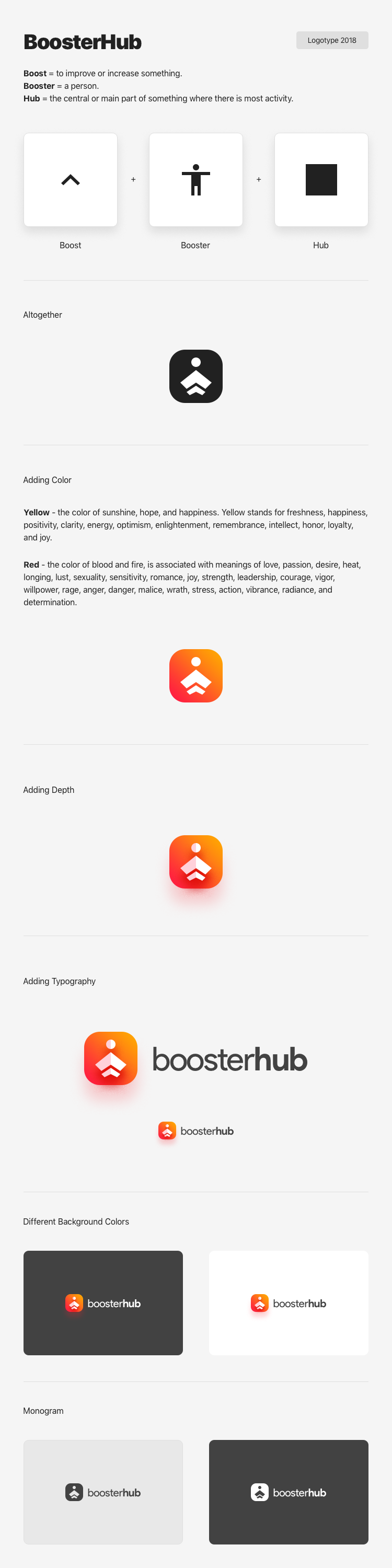
I also prepared a presentation explaining the rationale behind the symbol, helping the client understand not just what the logo looked like, but why it worked. I also designed the product UX/UI for the website. More about that here →
Project Framing
This was a compact branding exercise for a gaming product that needed to feel digital-native, legible, and social-ready from the beginning.
Approach
I treated the logo as part of the wider product system rather than as an isolated mark, aiming for something flexible enough to work across interfaces, social avatars, and presentation material.
Logo Presentation
This presentation captures the thinking behind the identity and how it was translated into a final digital-ready mark.