BoosterHub
BoosterHub was a gaming services platform where experienced players helped others improve rank progression, find boosters, and manage related activity in one place.
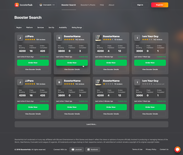
This project was exciting because it combined marketplace browsing, account-related flows, and chat inside a product aimed at a very specific gaming audience. My role was to make that complexity feel easier to scan and navigate across desktop and mobile.
A big part of the work was organizing dense, two-part navigation and preserving clarity on smaller screens. I also created the branding direction for the project. More about that here →
Challenge
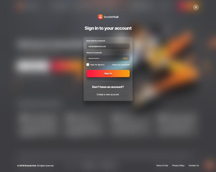
The product had to support browsing, trust, account-related actions, and direct communication inside one gaming-focused flow. The main UX challenge was keeping that structure understandable without overwhelming users.
Approach
I focused on clearer hierarchy, modular navigation, and early wireframing to make the core paths easier to scan on both desktop and smaller screens.
Early Structure
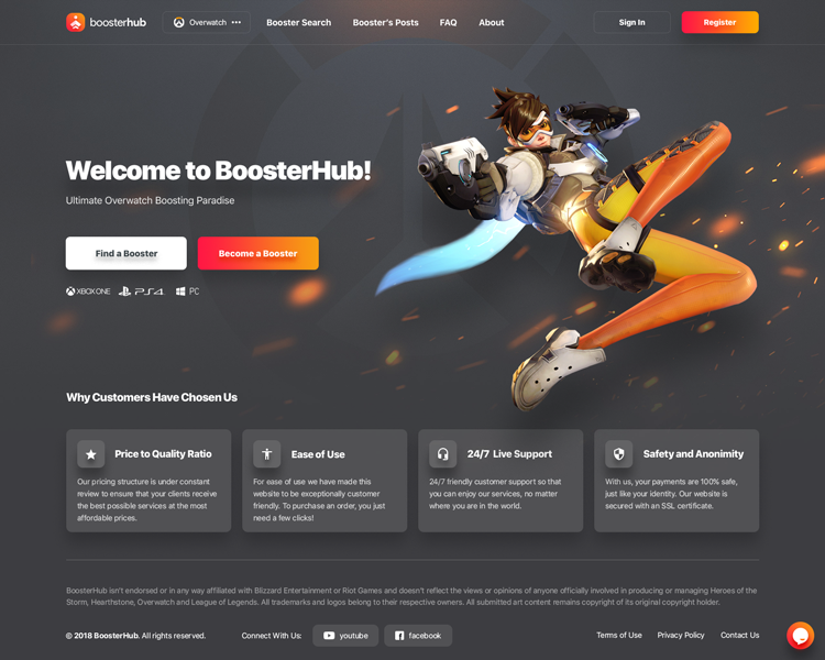
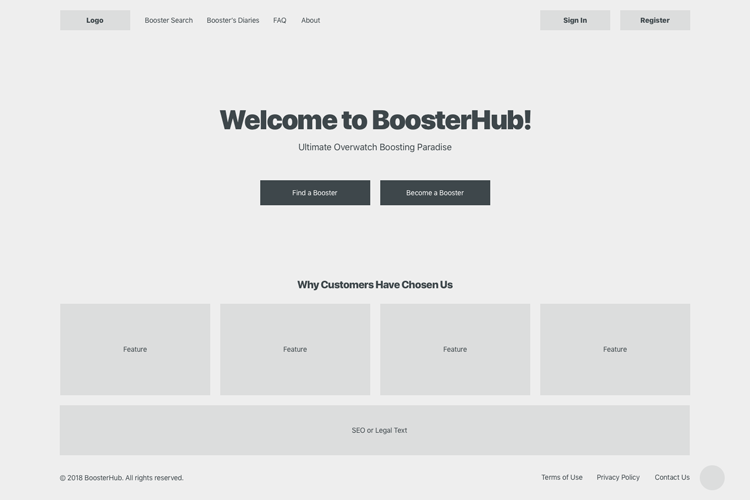
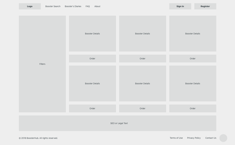
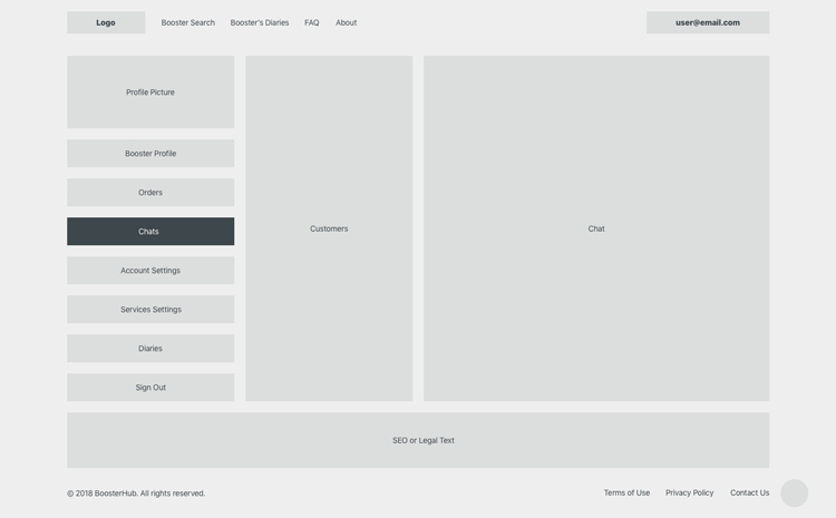
I started with lo-fi wireframes to align the main product structure early: homepage hierarchy, booster discovery, and communication flows. That helped validate the product logic before moving into polished UI.
Selected Screens
Mobile
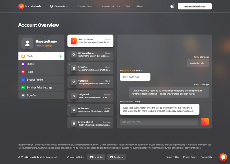
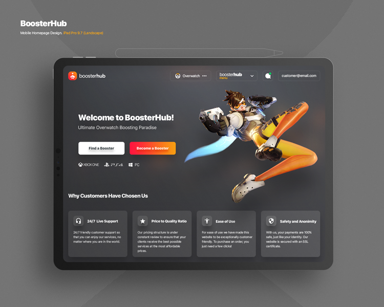
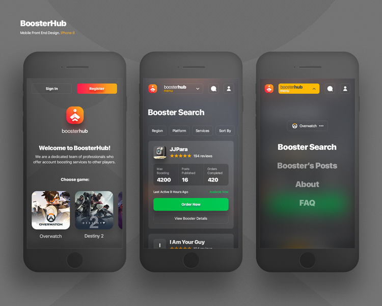
These screens show how the product adapted to smaller devices while preserving navigation clarity and core marketplace actions.
Desktop
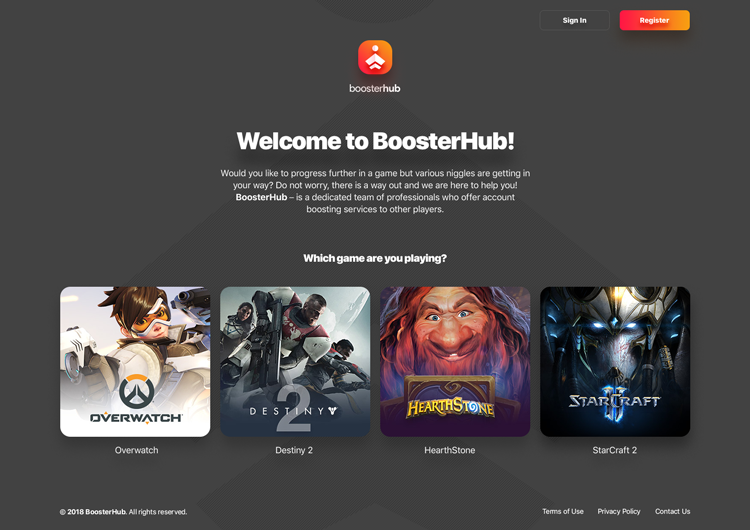
At the time, BoosterHub supported one game, but the product was being prepared for expansion. That is why a pre-home page was created to support future growth.