

Tonybet App
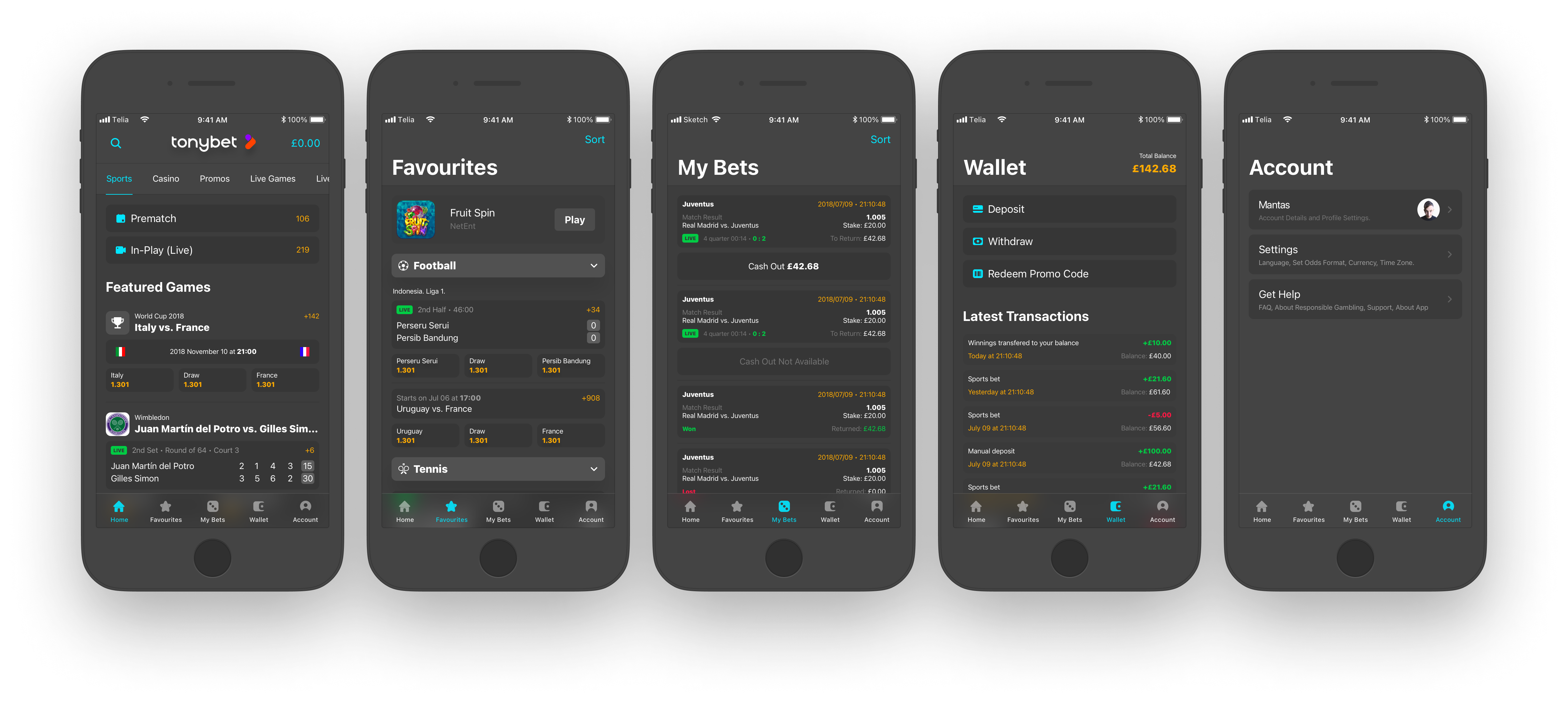
I was involved from the early stages of designing Tonybet’s mobile betting app, helping shape a product that had to handle large amounts of information, quick user decisions, and multiple betting contexts within a compact mobile interface.
Designing for Speed, Density, and Clarity
Sports betting products are complex by nature. Users need to scan many events, compare odds, understand live states, and place bets quickly without losing context. That made clarity and hierarchy just as important as visual style.
Challenge
The app had to support thousands of sporting events, multiple content types, and high-pressure user behavior in a small mobile space. The main challenge was designing an interface that felt information-rich without becoming overwhelming, while keeping navigation and bet placement fast and understandable.
Design Goals
My goal was to create a mobile experience that balanced density with clarity: clear hierarchy, fast scanning, reusable patterns, and enough visual structure to help users make decisions confidently in both pre-match and live scenarios.
Process
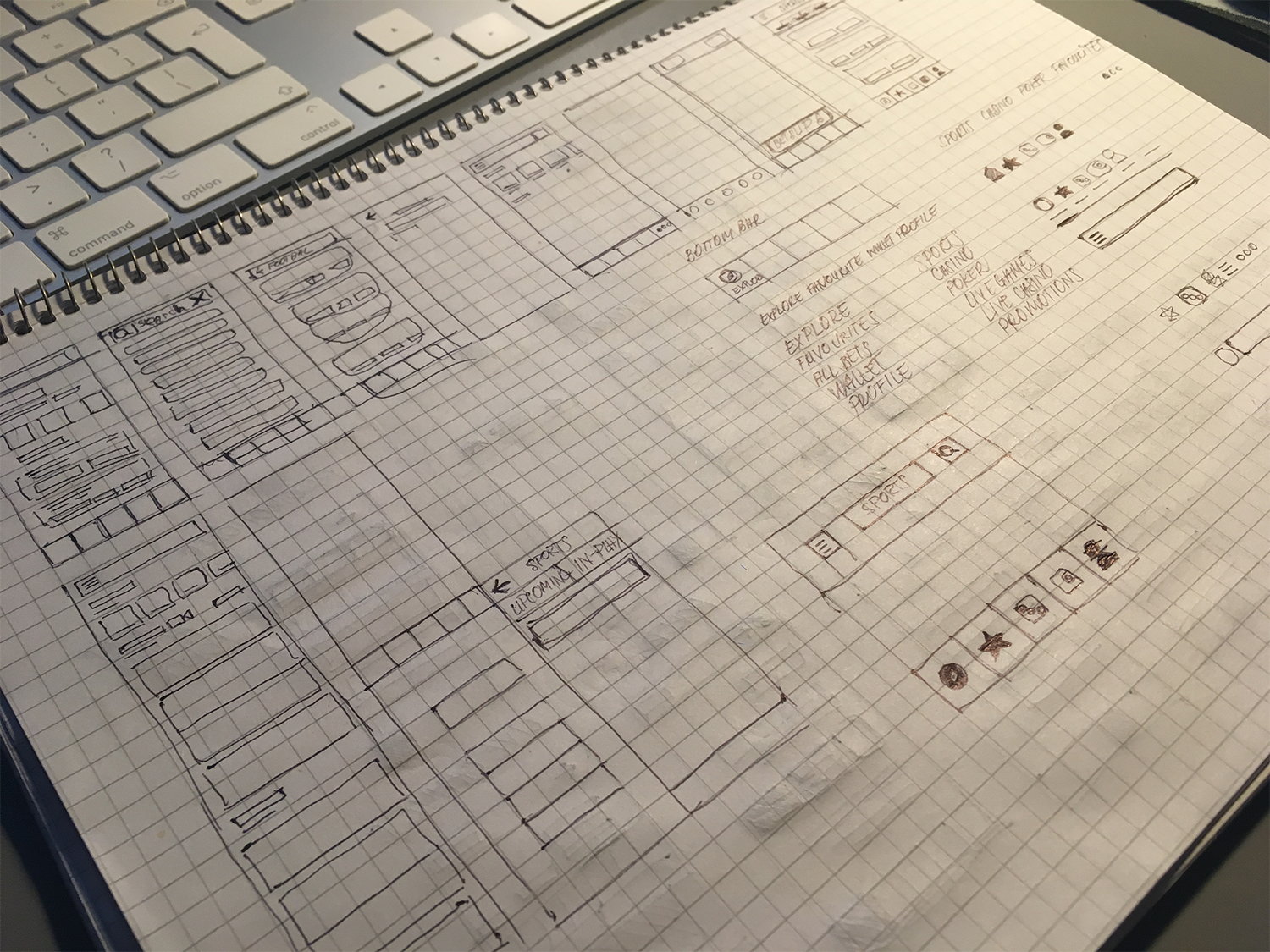
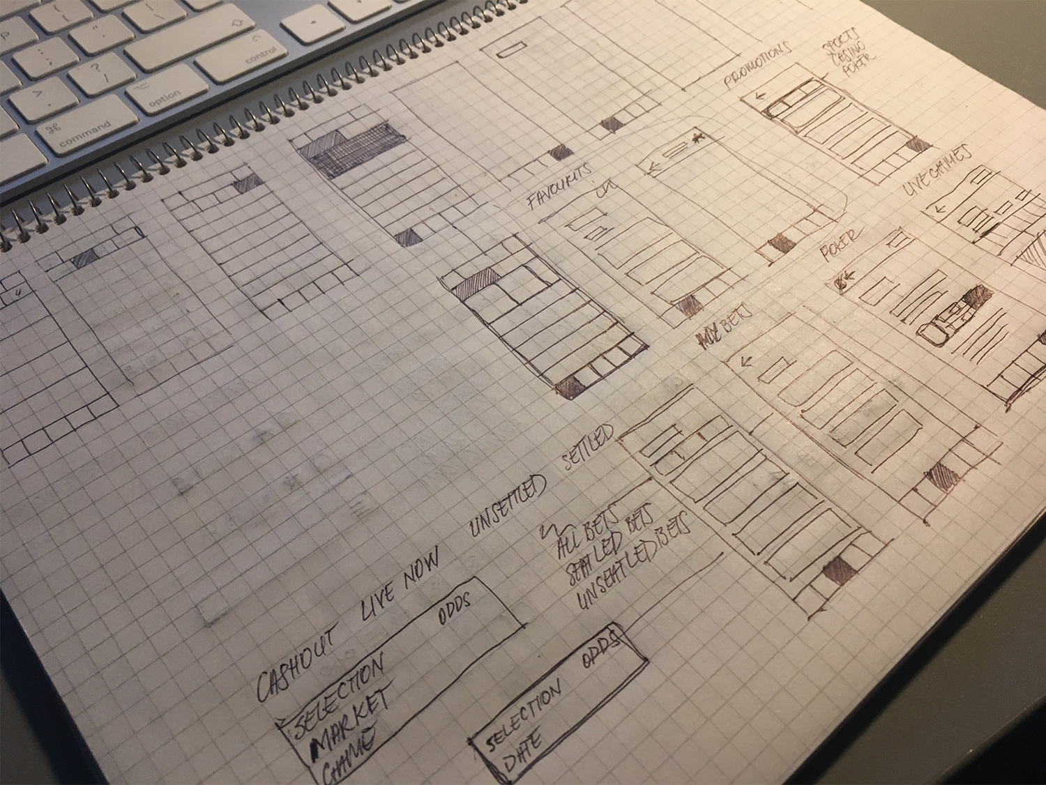
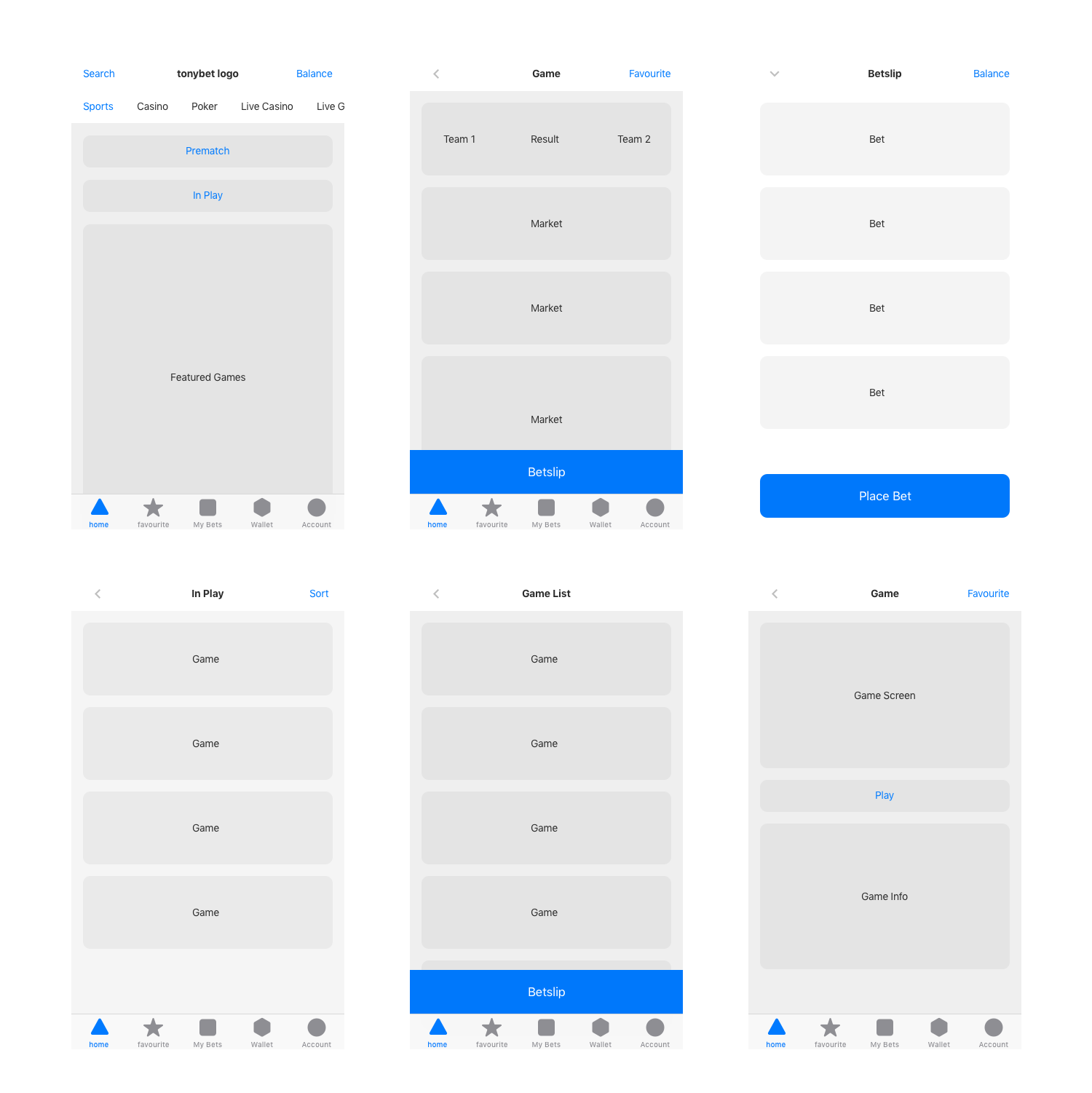
I started with competitor research, sketching, and lo-fi wireframes to explore navigation, event hierarchy, and betting flows before moving into detailed UI. This helped test structure early and reduce complexity before committing to polished screens.
Solution
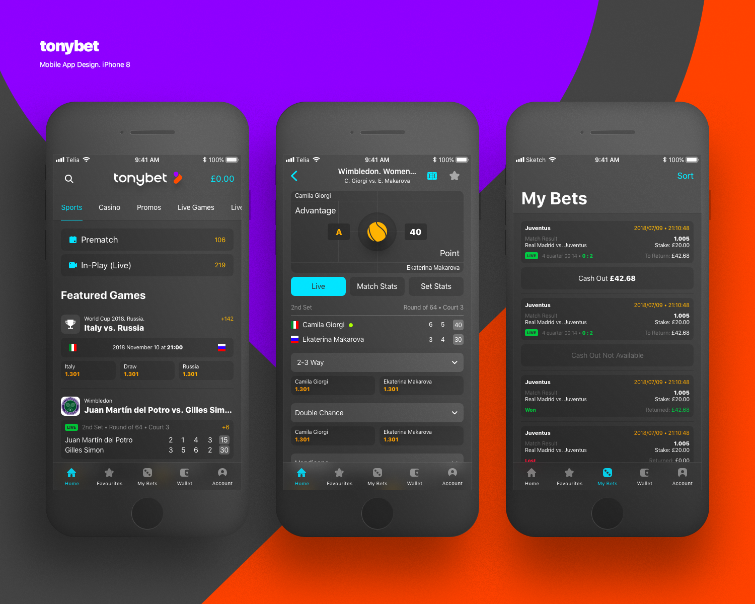
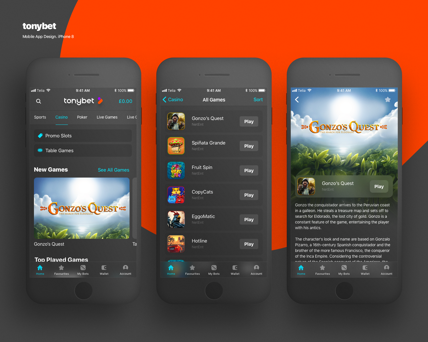
The final interface relied on strong visual hierarchy, reusable components, and clear grouping of betting information. I designed around 64 screens covering key journeys across navigation, events, odds presentation, betslip interactions, and casino-related views, making sure the experience remained coherent even as complexity increased.
A big part of the work was reducing friction in fast-paced contexts: helping users move from browsing to selection to bet placement without feeling lost, and making dense screens feel structured instead of noisy.
What Made It Interesting
This project stood out because it required both product thinking and interface discipline. It was not just about making betting screens look polished, but about organizing a high-density experience so users could make quick decisions with confidence.